Common navigation in Update 4

I noticed that the global navigation features are implemented WAY better in Update 4 then earlier versions.

If you click the “waffle” (3×3 dot grid) in the top left corner in Update 4, you get the Office 365 apps dialogue instead of opening a new pane with Office 365.

update4waffle

Nice!

Dynamics 365 for Operations Update 4

In the recent post from Redmond we can read that Dynamics 365 for Operations is going to get platform Update 4 and it packs a punch. Here is a quick overview:

An ENTIRELY new work space design with rich embedded Power BI reports.
power-bi-in-d365-workspaceopsblog3


Release of the Mobility solution
opsblog4

Release of the interactive Gantt chart control for doing visual scheduling.
opsblog5

New feedback solution (which I hope is optional)
opsblog6

They are also from now on going to launch updates every month for the platform.
All in all this is a pretty large update and I can’t wait to get my hands on it.

D365 Operations is available on-premise! …again.

In the latest blog post of Sri Srinivasan the news about an on-premise solution for Dynamics 365 for Operations is making a comeback.

Microsoft has been a bit back and forth on the topic, because when AX7 was released it had a road map that said an on-prem solution was in the works and it was disclosed that it was going to run on Azure Stack.
After a while this was redacted and when Dynamics 365 for Operations was launched, the only alternative was a SaaS solution and it would only be available in the cloud. That did not sit well with a lot of customers and partners and Microsoft went back to the drawing board.
At Summit 2017 we were presented with the hybrid cloud solution where parts of the application workloads would be available as an partially offline solution to ensure better operational trustworthiness on sites, but it would sync up to the mothership in the cloud. It would have to be a hybrid solution as many of the services would only reside in the cloud. This is now referred to as “Cloud and Edge”.

NOW we are at the stage where the business data will be able to stay on-prem indefinitely with the selection of the “local business data” deployment scenario. LCS will still handle the application and the benefit of Automated deployments are still there, but data will not leave the premise. Even an on-prem license through SA/BREP will be available!

When? Q2 CY2017!

The distribution options for Dynamics 365 for Operations should now cater to any business needs through the model best suited for the customer. Thank you Microsoft for listening to your customers and partners.

Take your pick!
sri-blog-post-grid-graphic

More information will be disclosed at D365 Tech17!

Quick Tip: New warehouse app and scaling

Supply chain and warehouse management guru, fellow countryman, fellow MVP and part time Pied piper Kurt Hatlevik just posted about the new warehouse app for Dynamics 365 for Operations. Read it here!

What a nice menu. Click for full image.

You can also check out the setup procedure from the AX Wiki here: https://ax.help.dynamics.com/en/wiki/install-and-configure-dynamics-365-for-operations-warehousing/

Now I played around with it a bit and I have to say I really like it and I’m so excited to see the nice interface and how intuitive and informative it is.

I did come across a neat little nicety while testing it, and that is the fact that you can adjust the font and layout size. This can be set so that you have all information on a single pane of glass and not be required to swap tabs to find info about the object you’re scanning.

Instead of this:

Notice the tabs on top?

You get this:

View all the data!

Doesn’t that look great on my Lumia 950?!

Just go to Display settings and adjust the Layout to 0,5 and flip your phone horizontal.

Change the settings here... Click for full image size.

Not rocket science, but still nice to know…

Subscribe to the Dynamics Podcast and look forward to us getting Markus Fogelberg from Microsoft on to talk to us about the new app in the beginning of February!

Quick tip: FastTab summaries

The FastTab is the grouping of fields that you can collapse and expand. They replaced the vertical tabs in the older versions (even though some forms still use tabs). It made the forms grow vertically and did take some time getting used to, but it did solve the problem that fields where not visible unless you had the tab open, even if your screen had room to spear. However there is another very large advantage on the FastTabs layout versus the tabular, and that is the FastTab summaries!

fasttabsummaries1

These are fields located to the left on the fast tab header. They contain elements within a fast tab grouping and are visible even if it is minimized/collapsed.

The form comes with a set of standard elements, but you can also select your own fields to be added.

Let’s say you want the Item group visible on the “Manage cost” fast tab… Just right click the field in the form and tick the “Personalize: Item group”.

FastTabSummaries2.png

In the “Personalize” dialogue, tick the “Include in FastTab summary”

fasttabsummaries3

Now refreshing this form will now show the Item group on the “Manage cost” FastTab.

FastTabSummaries4.png

You now no longer have to expand this to control that parameter. So in effect you could get a glance at most of the key parameters in a single screen. GREAT!

Oh… and you can also jump directly to a fast tab and expand it by clicking ALT + the number which the FastTab is located as from the top of the form. In the form in the image above, ALT + 9 would take you to the “Manage cost” FastTab.

Default order setting on items has changed

I was setting up for a demo and I noticed that there has been a minor change in the way that you setup your default order settings.

defaultorderchanges
Comparison from Dynamics AX 7 and Dynamics 365 for Operations

The site specific order settings are now gone and now are now merged with the default order settings and it has now got a “Rank” of the settings.

defaultorderchanges2.png

Rank 0 has the ability to add a default site. This is the record similar to the old “Default order settings”. “Site specific settings” in earlier versions are now the new records with different ranks in this list.

defaultorderchanges3.png

Not a major change, but it did put me off a bit… and it is nice to not have to go to multiple screens as well as I would imagine that the ranking can be used for supply chain management in some way shape of form.

Please comment if you have additional information.

Upcoming Power BI Content packs and reports

Taking a quick glance at the roadmap for Dynamics 365 you can see hat there are a lot of focus on improving BI. Currently there are 6 new content packages on the drawing board and an improved Power BI analysis of Cash flow. The current Power BI Content packages and reports on the drawing board are:

Asset management Power BI content
Giving a high level and detailed insight to enable CFO and operational workers to do key decisions on handling assets like choosing depreciation models, retirement, future investments and more.

Cost Accounting Power BI reports
cost-accounting-power-bi-reportsThe roadmap shows us a detailed view of some gauges and the data structure already created. The new Cost accounting features will be accompanied with great insights.

The roadmap sais this is tailored for C-level managers to be able to build rich visualizations to highlight performance from multiple companies in a common currency.

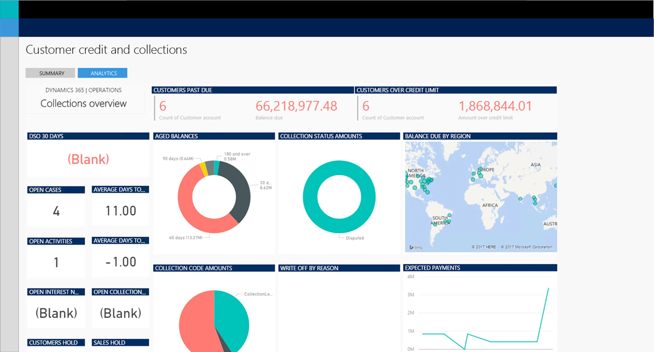
Credit management Power BI content
As a key part of the business, collecting money and keeping track of customer payments is undoubtably one of the most important aspect to have a healthy business and lower risk. The content pack will give you insights to pick up on customer patterns, discover hidden sources of cash, point out what direction to go in when it comes to customer focus and much more. A great detailed description is available on the roadmap website.

Expense management Power BI content
Get insights into the vast amount of data collected through the expense management features to be able to better budget and predict trends. Also keep up to date on statuses, discover bottlenecks and more.

Purchasing analysis Power BI content
Get the power to better engage with vendors with this important set of data at your finger tips. Track vendor performance and future purchasing requirements to get better deals and find large payments to decide on negotiating for early settlement bonuses +++. Read the full description on the roadmap website.

Warehousing Power BI reports
Doesn’t say much on the roadmap website, so I would assume that this is in the early stages. Warehouse operations produce a vast amount of data that can be eligible for interpretation and give you great insights in to making good decisions to improve efficiency and lower cost.


All in all the content packages are of extremely high value as they virtually require no effort to implement and gains entirely new insights in just minutes. Looking forward to see the results of the content packages currently in development and what areas they will decide to tackle next.


Dynamics podcast // Episode 7 // BrandingNoise

Jon Rivers and Jeff Shuey join us to talk about Marketing and branding, the Microsoft acquisition of LinkedIn, the different Dynamics conferences, how to reach out to Millenials, IAMPC and much more.

Hosts:
Fredrik Sætre — @AxFredrik
https://www.dynaxtips.com

Tommy Skaue — @Skaue
https://yetanotherax.com

Guests:
Jon Rivers — @jon_rivers and @brandingnoise
https://linkedin.com/in/jonrivers
https://marketingmonarchs.com

Jeff Shuey — @jshuey
https://linkedin.com/in/jeffshuey
https://www.iamcp.org

///////////////////////////////////////////////////////////////
Be a part of the AX community!
https://www.dynamicsuser.net/ax/
https://community.dynamics.com/ax/
//////////////////////////////////////////////////////////////

Music courtesy of Cannavo&Nesse

D365 Operations on a Mobile phone

There are two ways that D365 Operations are supposed to be interacted with on mobile phone. We’ve got the Mobile App with the awesome foundation that can basically expose any form to the end user in a mobile format, and then we have the WHS Mobile Terminal interface that covers all operations in logistics as well as all logistics for manufacturing operations.
But probably the most common way people will experience interfacing with the application on mobile would be to a browser on a mobile phone to the HTML 5 general client. I did try this out pretty early on and wrote about it. The experience wasn’t all that amazing, but it worked in a way. That was three versions ago, so I’d thought I’d have another crack at it.

wp_ss_20161111_0001

The dashboard works very well and the module navigation now takes a full screen experience that I really liked.

wp_ss_20161111_0007

One of the first things I noticed was that the interface now was much better on a cell phone. The previous version had two rows when looking at detail forms and that made the experience pretty “scrolly”. Mobile interfaces are best when there is only one way of scrolling required, either vertical or horizontal, but once you put data in both axis of your field of view it can get a bit disorienting and hard to find the data. I am happy to report that this has been dealt with and is now a much better experience.

wp_ss_20161111_0009  wp_ss_20161111_0010

The work centers function pretty good as well. It is aligned to work in the horizontal axis, but scales pretty well in both portrait and landscape mode.

wp_ss_20161111_0002

There is an issue with interaction on grids as these naturally would be horizontal in nature. However the experience is very nice as the scrolling now only affect the grid it self and the rest of the data stays static. This is also where the Mobile App shines as you can transform grid lines to be a field list interaction that is more suited for mobile entry.

wp_ss_20161112_0002

wp_ss_20161111_0008

wp_ss_20161112_0001

The only place I experienced a bit of a disconnect with the interface was on the dialogue boxes. In this case they still don’t go full screen, but has the menus peeking through on the left side of the screen. It also puts data in two columns that require some two axis navigation. Not horrible, but not perfect either…

wp_ss_20161112_0003


All in all it was a much better experience then the last time. The forms scale very well to the mobile format and it is a very smooth experience that can stack up to any web application for mobile interface. I am impressed and very enthusiastic!

Team Member seat count discount

Disclaimer: I have not read licensing policies, rules and regulations, and I urge you to make sure that you abide by them at ALL time!

teammemberpricing

The Team Member access for Dynamics 365 is being discounted the more users you have, so at some levels you would be better off jumping to the next price point by adding more users. I’m not sure that billing from Microsoft would take this in to account. That said, you would be better off in some cases by reporting a higher user count then you are actually using to hit the next discount tier (ONLY IF THIS IS PERMITTED) or add more users as there are some plateaus on the license plan… SO BRING ON THE CALCULATOR!

teammemberpricegraph

You’ll first hit the first jump at 85 (85*$10=$850)users. At that point you would be better off reporting 100 (100*$8,5=$850) users as reporting 86 users would cost you $10 more.

Here is a table to go by:

From To Optimal
0 85 Actual count
86 99 100
100 206 Actual count
207 249 250
250 392 Actual count
393 499 500
500 723 Actual count
724 999 1000
Above 1000 Actual count

Hopefully the Microsofts billing department will pick up on this and help you along or at least it will be accepted to report a HIGHER number then actual users used (If permitted). It will be a lot of work adding users for the jump from 723 to 1000…
Worst case scenario is that you don’t do anything and end up reporting 999 Team Member users. That would give you an excess of almost $1500 pr month!

You’re welcome!