
One of the obvious benefits of AX7 is off cause that the user interface is based on HTML5, which can be accessed using any recently (last couple of years) updated browser. My first thought was that it would be excellent to use a phone or a tablet to work with AX and I tried it out for quite a while on my Lumia 950XL.
It is great to be able to work on a phone to access your AX, but there are some areas in the standard forms that can be improved. However it gives a great platform to create an excellent mobile experience if you want.
The start page view is pretty good and it removes any unnecessary objects that are not all that important for daily use.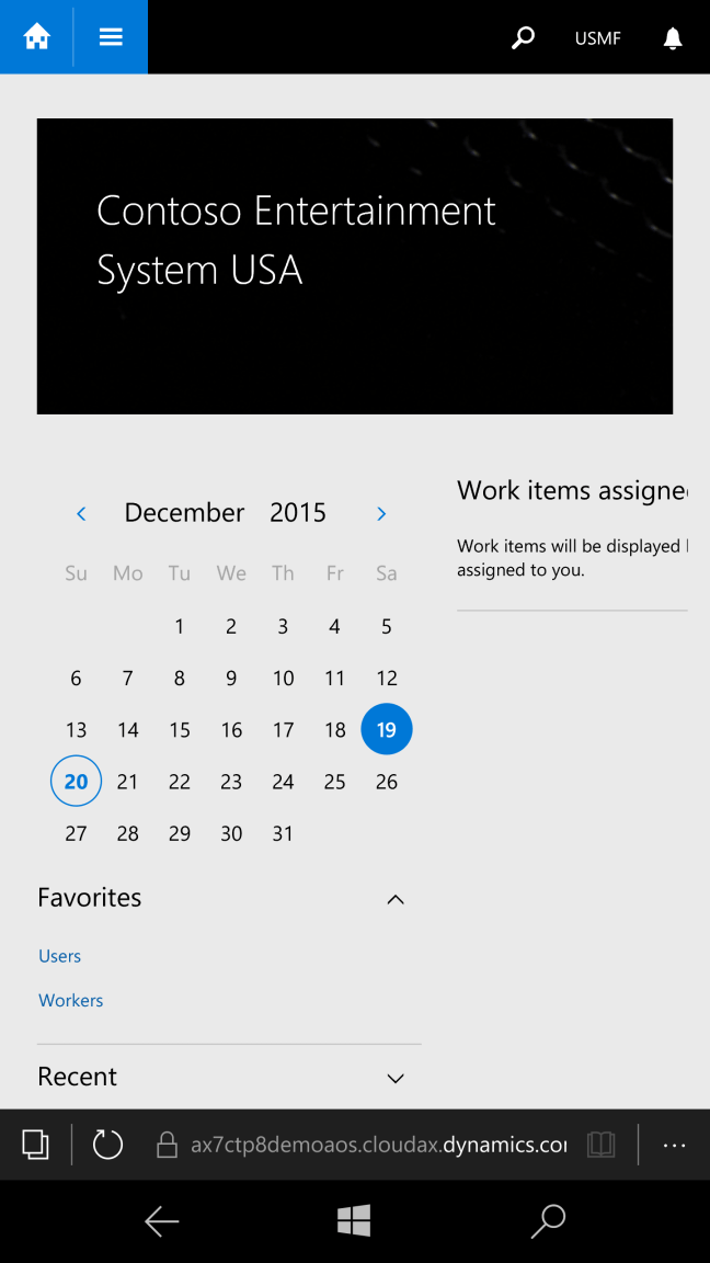
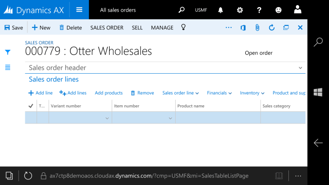
So the design of forms are mobile responsive. Elements move off when not necessary and even working with both header and line forms.
Working with a data rich form in a mobile view isn’t close to a large screen, but it is good enough if you reduce the amount of fields to the absolute minimum.

Flipping to landscape does help.
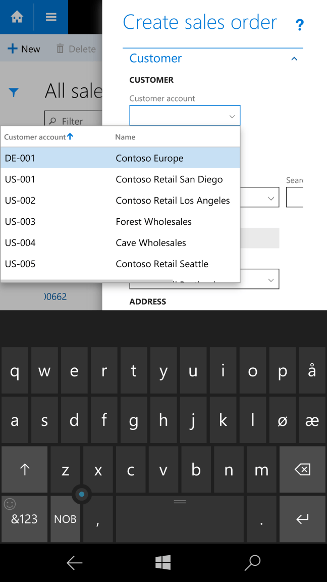
Only thing I would like to see is that the wizard dialogue in the right side of the screen would go full screen if the resolution is low enough. There is no reason to not in my opinion.
You can do any function on a phone that you can do in the desktop. Which gives GREAT power to the user. Access and do anything, anywhere!
I tried to print and that worked wonderfully.

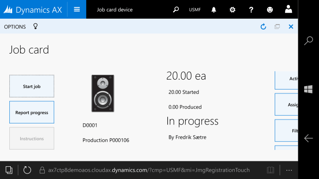
The one screen made for tablets is just a tad small for phone, but I bet it is awesome on a tablet.
All in all this is a fantastic opportunity to make a great mobile experience for the end user. It is quick, responsive and looks great. Imagine all the power of AX on your phone. AX7 makes this happen!
 dyntips.com by Fredrik Sætre
2 thoughts on “AX7 – Mobile experience”